Browsing as a guest.Preview anything. Sign in to make it yours.
← Explore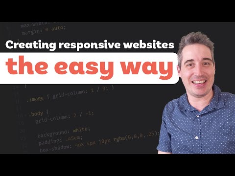
EngineeringPublic · published 4 Sept
Responsive Layouts Made Easy
A guide to simplifying responsive web design by structuring HTML for complexity first, styling the mobile view, and layering complexity with media queries.
Coursified Library ↗
source: Kevin Powell
Outline · 9 modules · quiz after each
01Introduction and HTML StructureWrite HTML based on the most complex (desktop) state to organize the structure effectively.11 min
02CSS Variables and TypographySet up CSS custom properties for colors and fonts to ensure consistency and easy updates.6 min
03Styling Utility Classes and BackgroundsCreate utility classes for background colors using CSS variables.5 min
04Layout Structure and Mobile FixesUse a container class with margin-inline auto and min() for responsive width management.8 min
05The Mobile-First ApproachStyle the base design for mobile first to ensure functionality without complex overrides.3 min
06Course PromotionoptionalDetails about the free 'Conquering Responsive Layouts' 21-day drip course are provided.1 min
07Implementing Flexbox LayoutsImplement Flexbox with a default column direction that switches to row inside a media query.3 min
08Advanced Spacing and ScalabilityUse the adjacent sibling selector (* + *) within a media query to create gaps between columns.5 min
09Conclusion and Final ThoughtsoptionalRecap of the workflow: look at the big picture, structure HTML, and style mobile-first.2 min
0
clones1
learnerNew
no ratings yet9
modulesCloning copies the outline, quizzes and assessment into your account. The video stays on YouTube; attribution to Coursified Library stays on the course.
Details
Duration43 min
Assessment20 questions · pass 70%
Quiz questions74
LanguageEnglish
LicenceOutline CC BY · video © channel
CertificateYes · verifiable
NewNo ratings yet